No political message intended.
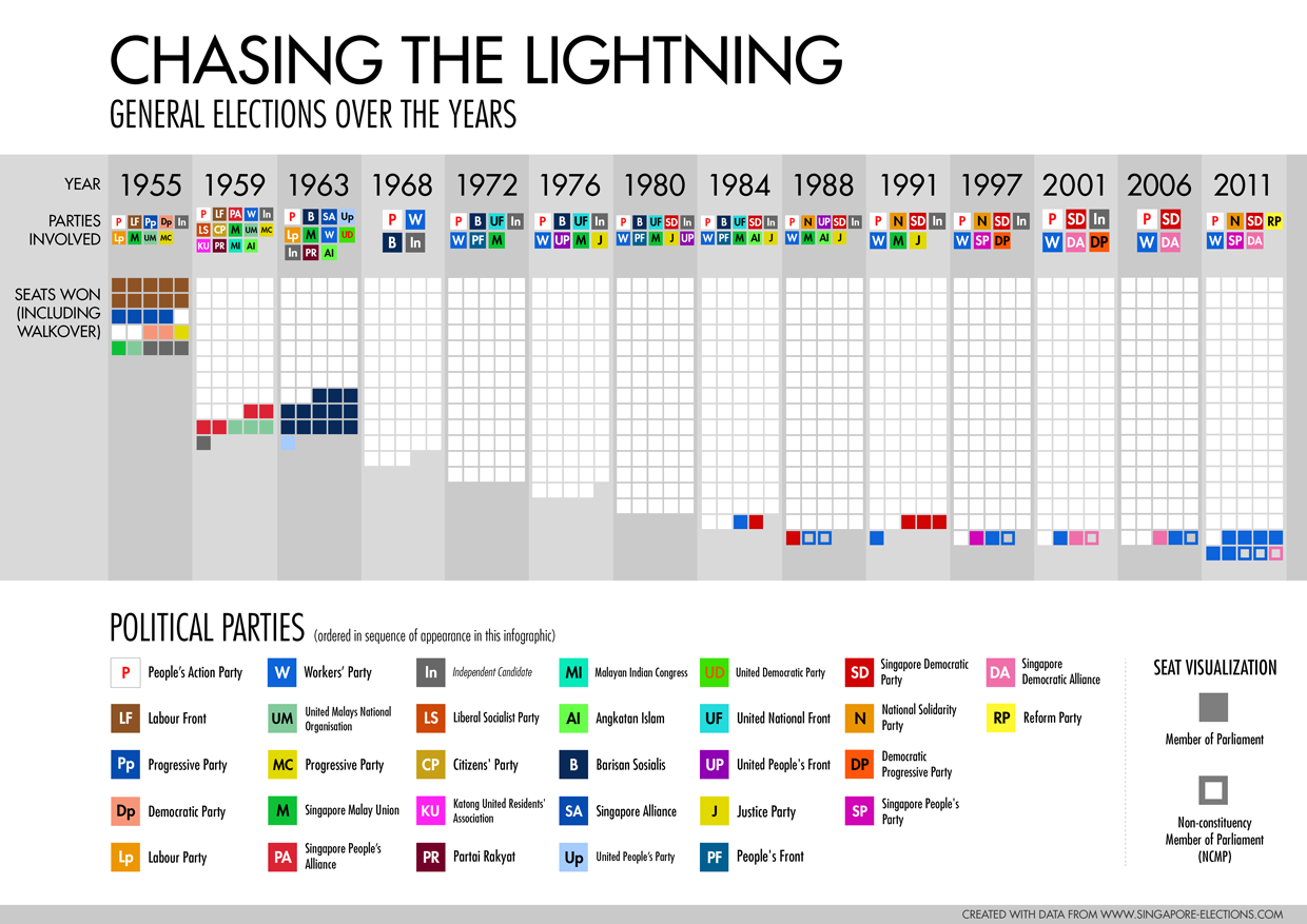
This is a deceptively simple infographic tracing the general election results since 1955.
Alternate title: C’est la Fête – It’s a Party.
This was the first assignment for a Data Visualisation module when I was reading my degree at the National University of Singapore. The assignment was simple – to produce an infographic that shows certain sets of data (I think a minimum of 2) against time. Being the gung-ho undergrad back then, I showed 5:
1. Years when General elections were held (and number of elections)
2. Political parties involved in each election (and number of contesting parties in each election)
3. Number of seats in Legislative Assembly (Before 1968) and Parliament (1968 and after)
4. Allocation of seats won (or ‘walkover’) by party, including NCMP seats.
5. Names of political parties that participated in elections from 1955 to 2011.
Tensely Designed
In this infographic are some deliberate design ‘missteps’ to convey a haphazard struggle against a dominant force, and to generate tension for the viewer. Graphical elements arranged in opposing orders – parties in horizontal and vertical lists. The upside-down orientation of the seat graphs. The seemingly random choice of colours to represent political parties. The bountiful white spaces.
Of Parties and Colours
Political party names are represented in the form of coloured squares and abbreviated forms of the party names. It chose to mimic the way elements are named in the periodic table – although a more modern example would be Adobe Creative Suite icons. The squares are neatly aligned in a consistent pattern to maximize information displayed in a very ‘grey’ area – that sometimes looks more white than grey.
White has a special emphasis to the People’s Action Party’s power and dominance. White spaces are reserved for the top (showing its relevance to the infographic title) and at the bottom (contrast with other colours). The large amount of negative space connotes the ruling party’s connections and size.
Colour chosen to represent each icon was first linked to each party’s theme colours, followed by pragmatic choice of visual differentiation towards the end (because most parties used blue and red). In the end, which colours really matter?
Multiples and Mass
Inspired by Tufte’s concept of ‘small multiples’, the middle section shows the results in the form of squares representing seats. A brief observation would come to a conclusion that over time: Seats increase, and the same party remains dominant after becoming the ruling party in the early years. Numbers are intentionally not included as an aesthetic: that the mass of ‘white squares’ is more than enough to communicate the dominance and direction of the ruling party’s performance.
This piece was exhibited at the Random Blends 2014 exhibition in the ArtScience Museum, Marina Bay Sands.
Revised in 2015 – edited for accuracy.
No comments yet.